-
- Mod 4 - Log Reg
- 4.1 Overview
- 4.2 Odds, Odds Ratios and Exponents
- Quiz A
- 4.3 A General Model
- 4.4 Log Reg Model
- 4.5 Logistic Equations
- 4.6 How good is the model?
- 4.7 Multiple Explanatory Variables
- 4.8 Methods of Log Reg
- 4.9 Assumptions
- 4.10 Example from LSYPE
- 4.11 Log Reg on SPSS
- 4.12 SPSS Log Reg Output
- 4.13 Interaction Effects
- 4.14 Model Diagnostics
- 4.15 Reporting the Results
- Quiz B
- Exercise
- Mod 4 - Log Reg
Using Statistical Regression Methods in Education Research

4.12 The SPSS Logistic Regression Output
|
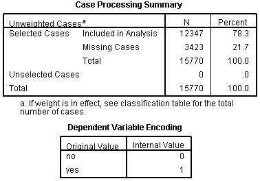
SPSS will present you with a number of tables of statistics. Let’s work through and interpret them together. Again, you can follow this process using our video demonstration Figure 4.12.1: Case Processing Summary and Variable Encoding for Model
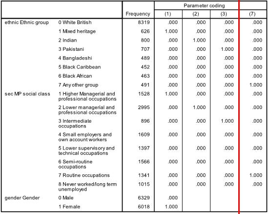
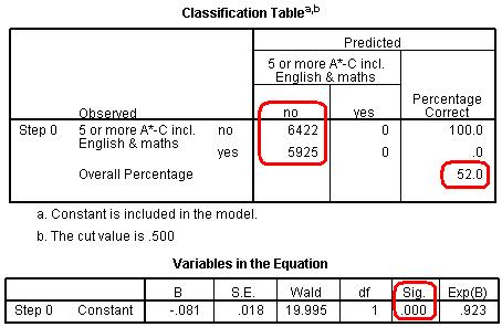
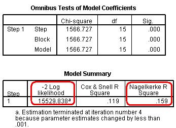
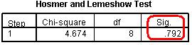
The Case Processing Summary simply tells us about how many cases are included in our analysis The second row tells us that 3423 participants are missing data on some of the variables included in our analysis (they are missing either ethnicity, gender or fiveem, remember we have included all cases with missing SEC), but this still leaves us with 12347 cases to analyse. The Dependent Variable Encoding reminds us how our outcome variable is encoded – ‘0’ for ‘no’ (Not getting 5 or more A*-C grades including Maths and English) and ‘1’ for ‘yes’ (making the grade!). Next up is the Categorical Variables Encoding Table (Figure 4.12.2 - slightly truncated here). It acts as an important reminder of which categories were coded as the reference (baseline) for each of your categorical explanatory variables. You might be thinking ‘I can remember what I coded as the reference category!’ but it easy to get lost in the output because SPSS has a delightful tendency to rename things just as you are becoming familiar with them… In this case ‘parameter coding’ is used in the SPSS logistic regression output rather than the value labels so you will need to refer to this table later on. Let’s consider the example of ethnicity. White British is the reference category because it does not have a parameter coding. Mixed heritage students will be labelled “ethnic(1)” in the SPSS logistic regression output, Indian students will be labelled “ethnic(2)”, Pakistani students “ethnic(3)” and so on. You will also see that ‘Never worked/long term unemployed’ is the base category for SEC, and that each of the other SEC categories has a ‘parameter coding’ of 1-7 reflecting each of the seven dummy SEC variables that SPSS has created. This is only important in terms of how the output is labelled, nothing else, but you will need to refer to it later to make sense of the output. Figure 4.12.2: Categorical Variables Coding Table The next set of output is under the heading of Block 0: Beginning Block (Figure 4.12.3): Figure 4.12.3: Classification Table and Variables in the Equation This set of tables describes the baseline model – that is a model that does not include our explanatory variables! As we mentioned previously, the predictions of this baseline model are made purely on whichever category occurred most often in our dataset. In this example the model always guesses ‘no’ because more participants did not achieve 5 or more A*-C grades than did (6422 compared to 5925 according to our first column). The overall percentage row tells us that this approach to prediction is correct 52.0% of the time – so it is only a little better than tossing a coin! The Variables in the Equation table shows us the coefficient for the constant (B0). This table is not particularly important but we’ve highlighted the significance level to illustrate a cautionary tale! According to this table the model with just the constant is a statistically significant predictor of the outcome (p <.001). However it is only accurate 52% of the time! The reason we can be so confident that our baseline model has some predictive power (better than just guessing) is that we have a very large sample size – even though it only marginally improves the prediction (the effect size) we have enough cases to provide strong evidence that this improvement is unlikely to be due to sampling. You will see that our large sample size will lead to high levels of statistical significance for relatively small effects in a number of cases. We have not printed the next table Variables not Included in the Model because all it really does is tell us that none of our explanatory variables were actually included in this baseline model (Block 0)… which we know anyway! It is however worth noting the number in brackets next to each variable – this is the ‘parameter coding’ we mentioned earlier. As you can see, you will need to refer to the Categorical Variables Encoding Table to make sense of these! Now we move to the regression model that includes our explanatory variables. The next set of tables begins with the heading of Block 1: Method = Enter (Figure 4.12.4): Figure 4.12.4: Omnibus Tests of Coefficients and Model Summary The Omnibus Tests of Model Coefficients is used to check that the new model (with explanatory variables included) is an improvement over the baseline model. It uses chi-square tests to see if there is a significant difference between the Log-likelihoods (specifically the -2LLs) of the baseline model and the new model. If the new model has a significantly reduced -2LL compared to the baseline then it suggests that the new model is explaining more of the variance in the outcome and is an improvement! Here the chi-square is highly significant (chi-square=1566.7, df=15, p<.000) so our new model is significantly better. To confuse matters there are three different versions; Step, Block and Model. The Model row always compares the new model to the baseline. The Step and Block rows are only important if you are adding the explanatory variables to the model in a stepwise or hierarchical manner. If we were building the model up in stages then these rows would compare the -2LLs of the newest model with the previous version to ascertain whether or not each new set of explanatory variables were causing improvements. In this case we have added all three explanatory variables in one block and therefore have only one step. This means that the chi-square values are the same for step, block and model. The Sig. values are p < .001, which indicates the accuracy of the model improves when we add our explanatory variables. The Model Summary (also in Figure 4.12.4) provides the -2LL and pseudo-R2 values for the full model. The -2LL value for this model (15529.8) is what was compared to the -2LL for the previous null model in the ‘omnibus test of model coefficients’ which told us there was a significant decrease in the -2LL, i.e. that our new model (with explanatory variables) is significantly better fit than the null model. The R2 values tell us approximately how much variation in the outcome is explained by the model (like in linear regression analysis). We prefer to use the Nagelkerke’s R2 (circled) which suggests that the model explains roughly 16% of the variation in the outcome. Notice how the two versions (Cox & Snell and Nagelkerke) do vary! This just goes to show that these R2 values are approximations and should not be overly emphasized. Moving on, the Hosmer & Lemeshow test (Figure 4.12.5) of the goodness of fit suggests the model is a good fit to the data as p=0.792 (>.05). However the chi-squared statistic on which it is based is very dependent on sample size so the value cannot be interpreted in isolation from the size of the sample. As it happens, this p value may change when we allow for interactions in our data, but that will be explained in a subsequent model on Page 4.13 Figure 4.12.5: Hosmer and Lemeshow Test
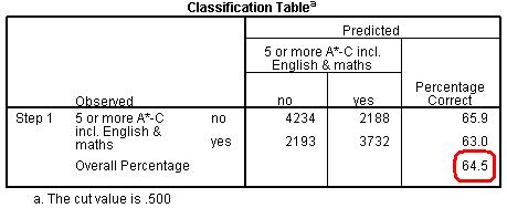
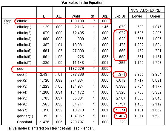
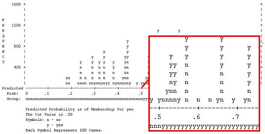
More useful is the Classification Table (Figure 4.12.6). This table is the equivalent to that in Block 0 (Figure 4.12.3) but is now based on the model that includes our explanatory variables. As you can see our model is now correctly classifying the outcome for 64.5% of the cases compared to 52.0% in the null model. A marked improvement! Figure 4.12.6: Classification Table for Block 1 However the most important of all output is the Variables in the Equation table (Figure 4.12.7). We need to study this table extremely closely because it is at the heart of answering our questions about the joint association of ethnicity, SEC and gender with exam achievement. Figure 4.12.7: Variables in the Equation Table Block 1 This table provides the regression coefficient (B), the Wald statistic (to test the statistical significance) and the all important Odds Ratio (Exp (B)) for each variable category. Looking first at the results for SEC, there is a highly significant overall effect (Wald=1283, df=7, p<.000). The b coefficients for all SECs (1-7) are significant and positive, indicating that increasing affluence is associated with increased odds of achieving fiveem. The Exp(B) column (the Odds Ratio) tells us that students from the highest SEC homes are eleven (11.37) times more likely than those from lowest SEC homes (our reference category) to achieve fiveem. Comparatively those from the SEC group just above the poorest homes are about 1.37 times (or 37%) more likely to achieve fiveem than those from the lowest SEC group. The effect of gender is also significant and positive, indicating that girls are more likely to achieve fiveem than boys. The OR tells us they are 1.48 times (or 48%) more likely to achieve fiveem, even after controlling for ethnicity and SEC (refer back to Page 4.7 Most importantly, controlling for SEC and gender has changed the associations between ethnicity and fiveem. The overall association between fiveem and ethnicity remains highly significant, as indicated by the overall Wald statistic, but the size of the b coefficients and the associated ORs for most of the ethnic groups has changed substantially (see the note below). This is because the SEC profile for most ethnic minority groups is lower than for White British, so controlling for SEC has significantly changed the odds ratios for these ethnic groups (as it did in our multiple linear regression example). We saw in Figure 4.10.1 that Indian students (Ethnic(2)) were significantly more likely than White British students to achieve fiveem (OR=1.58), and now we see that this increases even further after controlling for SEC and gender (OR=1.97). Bangladeshi students (Ethnic(4)) were previously significantly less likely than White British students to achieve fiveem (OR=.80) but are now significantly more likely (OR=1.47). Pakistani (Ethnic(3)) students were also previously significantly less likely than White British students to achieve fiveem (OR=.64) but now do not differ significantly after controlling for SEC (OR=.92). The same is true for Black African (Ethnic(6)) students (OR change from .83 to .95). However the OR for Black Caribbean (Ethnic(5)) students has not changed much at all (OR change .53 to .57) and they are still significantly less likely to achieve fiveem than White British students, even after accounting for the influence of social class and gender. Note: Before running this model we ran a model that just included ethnic group to estimate the b coefficients and to test the statistical significance of the ethnic gaps for fiveem. We haven’t reported it here because the Odds Ratios from the model are identical to those shown in Figure 4.10.1. However the b coefficients and their statistical significance are shown as Model 1 in Figure 4.15.1 where we show how to present the results of a logistic regression. The final piece of output is the classification plot (Figure 4.12.8). Conceptually it answers a similar question as the classification table (see Figure 4.12.6) which is ‘how accurate is our model in classifying individual cases’? However the classification plot gives some finer detail. This plot shows you the frequency of categorisations for different predicted probabilities and whether they were ‘yes’ or ‘no’ categorisations. This provides a useful visual guide to how accurate our model is by displaying how many times the model would predict a ‘yes’ outcome based on the calculated predicted probability when in fact the outcome for the participant was ‘no’. Figure 4.12.8: Observed groups and Predicted Probabilities If the model is good at predicting the outcome for individual cases we should see a bunching of the observations towards the left and right ends of the graph. Such a plot would show that where the event did occur (fiveem was achieved, as indicated by a ‘y’ in the graph) the predicted probability was also high, and that where the event did not occur (fiveem was not achieved, indicated by a ‘n’ in the graph) the predicted probability was also low. The above graph shows that quite a lot of cases are actually in the middle area of the plot, i.e. the model is predicting a probability of around .5 (or a 50:50 chance) that fiveem will be achieved. So while our model identifies that SEC, ethnicity and gender are significantly associated with the fiveem outcome, and indeed can explain 15.9% of the variance in outcome (quoting the Nagelkerke pseudo-R2), they do not predict the outcome for individual students very well. This is important because it indicates that social class, ethnicity and gender do not determine students’ outcomes (although they are significantly associated with it). There is substantial individual variability that cannot be explained by social class, ethnicity or gender, and we might expect this reflects individual factors like prior attainment, student effort, teaching quality, etc. Let’s move on to discuss interaction terms for now – we will save explaining how to test the assumptions of the model for a little later. Something to look forward to! |
 if you like.First of all we get these two tables (Figure 4.12.1):