Using Statistical Regression Methods in Education Research

1.6 SPSS: Tabulating Data
|
Graphing is a great way of visualising your data but sometimes it lacks the precision which you get with exact figures. Tables are a good way of presenting precise values in an accessible and clear manner and we run through the process for creating them on this page. Why not follow us through on the LSYPE 15000
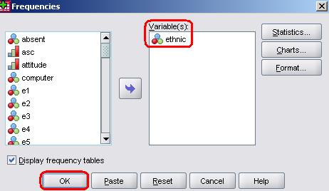
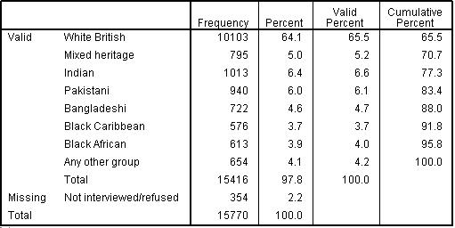
The frequency table basically shows you how many cases are in each category or at each possible value of a given variable. In other words it presents the distribution of your sample among the categories of a variable (e.g. how many participants are male compared to female or how many individuals from the sample fall into each socio-economic class category). It can only usually be used when data is ordinal or nominal – there are usually too many possible values for continuous data which results in frequency tables that stretch out over the horizon! Let us look at the frequency table for the ethnicity variable (ethnic). It will be good to see how the table related to the bar chart we created on the previous page. Take the following route through SPSS Analyse > Descriptive Statistics > Frequencies to access the following menu: This is nice and simple as we will not be requesting any additional statistics or charts (you will use these options, the buttons on the right hand side of the menu box, when we come to tackle regression). Just move ethnic over from the list on the left into the box labelled Variable(s) and click OK. Figure 1.6.1: Frequencies for ethnic groups
Our table shows us both the count and percentage of individual students in each ethnic group. ‘Valid Percent’ is the same as ‘Percent’ but excluding cases where the relevant data was missing (see our missing data Extension
B
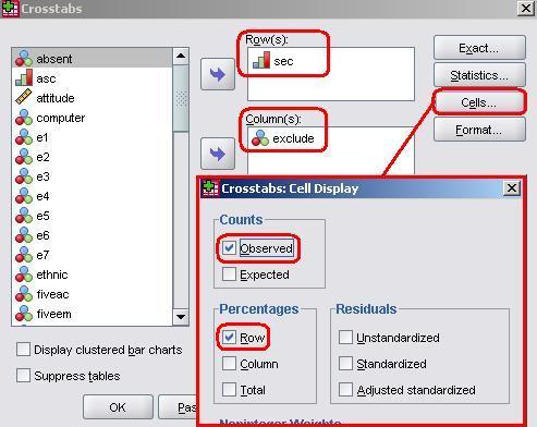
Crosstabs are a good way of looking at the association between variables and we will talk about them again in detail in the Simple Linear Regression Module (Page 2.2) Let us have a look at an example! We will see how socio-economic class (sec) relates to whether or not a student has been excluded in the last 12 months (exclude). The basic table can be created using Analyse > Descriptive Statistics > Crosstabs. The pop-up menu below will appear.
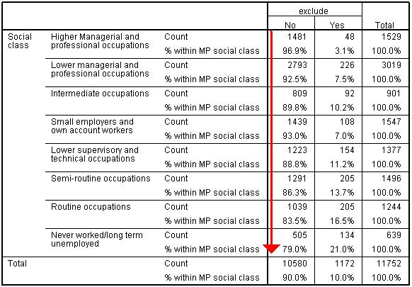
As you can see we need to add two variables, one which will constitute the rows and the other the columns. Put sec in the box marked Row(s) and exclude in the box marked columns. Before continuing it is also worth accessing the Cellsmenu by clicking on the button on the right hand side. This menu allows you to include additional information within each cell of the crosstab. ‘Observed’ is the only default option and we will keep that – it basically tells us how many participants have the combination of scores represented by that cell. It is useful to add percentages to the cells so that you can see how the distribution of participants across categories in one variable may differ across the categories of the other. This will become clearer when we run through the example. Check Row in the Percentages section as shown above to add the percentages of students who have and have not been excluded to each category of maternal education. Click OK to create the table. Figure 1.6.2: Crosstabulation of SEC and exclusion within last year
As you can see the 11,752 valid cases (those without any missing data) are distributed across the 16 cells in the middle of the table. By looking at the ‘% within MP social class’ part of the row we can see that the less affluent the background of the family the more likely the student is to have been excluded: 21.0% of students from ‘Never worked / long term unemployed backgrounds’ have been excluded compared to 3.1% of students ‘Higher managerial and professional backgrounds’. We will talk about associations like this more on Page 2.3
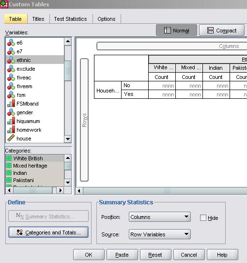
SPSS allows you to create virtually any table using the ‘Custom Tables’ menu. It is beyond the scope of the website to show you how to use this feature but we do recommend you play with it as it allows you to explore your data in creative ways and to present this exploration in an organised manner. To get to the custom table menu go Analyse > Tables > Custom Tables. The custom table menu looks like this:
It is worth persevering with if there are specific tables you would like to create. Custom tables and graphs have a lot of potential! |