Using Statistical Regression Methods in Education Research

2.3 Correlation
|
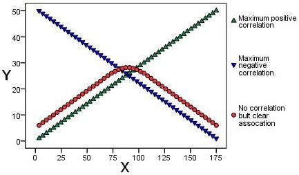
Scatterplots are the best way to visualise correlation between two continuous (scale) variables, so let us start by looking at a few basic examples. The graphs below illustrate a variety of different bivariate relationships, with the horizontal axis (x-axis) representing one variable and the vertical axis (y-axis) the other. Each point represents one individual and is dictated by their score on each variable. Note that these examples are fabricated for the purpose of our explanation - real life is rarely this neat! Let us look at each in turn: Figure 2.3.1: Displays three scatterplots overlaid on one another and represents maximum or 'perfect' negative and positive correlations (blue and green respectively). The points displayed in red provide us with a cautionary tale! It is clear there is a relationship between the two as the points display a clear arching pattern. However they are not statistically correlated as the relationship is not consistent. For values of X up to about 75 the relationship with Y is positive but for values of 100 or more the relationship is negative! Figure 2.3.1: Examples of 'perfect' relationships
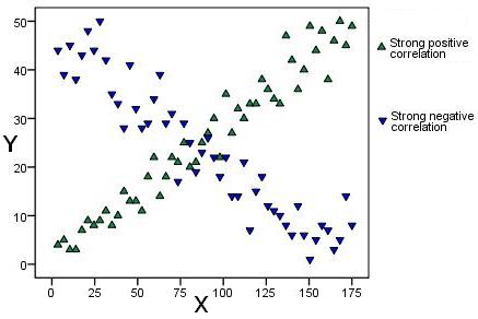
Figure 2.3.2: These two scatterplots look a little bit more like they may represent real life data. The green points show a strong positive correlation as there is a clear relationship between the variables - if a participant's score on one variable is high their score on the other is also high. The red points show a strong negative relationship. A participant with a high score on one variable has a low score on the other. Figure 2.3.2: Examples of strong correlations
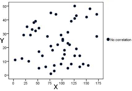
Figure 2.3.3: This final scatterplot demonstrates a situation where there is no apparent correlation. There is no discernible relationship between an individual's score on one variable and their score on another. Figure 2.3.3: Example of no clear relationship
Several points are evident from these scatterplots.
The next page will talk about how we can statistically represent the strength and direction of correlation but first we should run through how to produce scatterplots using SPSS/PASW.
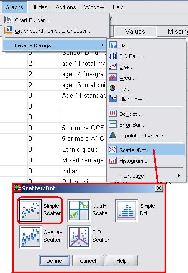
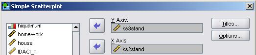
Let's use the LSYPE 15,000 A pop-up will now appear asking you to define your scatterplot. All this means is you need to decide which variable will be represented on which axis by dragging the variables from the list on the left into the relevant boxes (or transferring them using the arrows). We have put the age 14 assessment score (ks3stand) on the vertical y-axis and age 11 scores (ks2stand) on the horizontal x-axis. SPSS/PASW allows you to label or mark individual cases (data points) by a third variable which is a useful feature but we will not need it this time. When you are ready click on OK.
Et Voila! The scatterplot (Figure 2.3.4) shows that there is a relationship between the two variables. Higher scores at age 11 (ks2) are related to higher scores at age 14 (ks3) while lower age 11 scores are related to lower age 14 scores - there is a positive correlation between the variables. Figure 2.3.4: Scatterplot of ks2 and ks3 exam scores
Note that there is what is called a 'floor effect' where no age 11 scores are below approximately '-25'. They form a straight vertical line in the scatterplot. We discuss this in more detail in Extension A Now that we know how to generate scatterplots for displaying relationships visually it is time to learn how to understand them statistically. |
 dataset to explore the relationship between Key Stage 2 exam scores (exams students take at age 11) and Key Stage 3 exam scores (exams students take at age 14). Take the following route through SPSS: Graphs > Legacy Dialogs > Scatter/Dot (shown below). A small box will pop up giving you the option of a few different types of