Using Statistical Regression Methods in Education Research

1.5 SPSS: Graphing Data
|
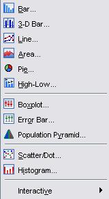
Being able to present your data graphically is very important. SPSS allows you to create and edit a range of different charts and graphs in order to get an understanding of your data and the relationships between variables. Though we can’t run through all of the different options it is worth showing you how to access some of the basics. The image below shows the options that can be accessed. To access this menu click on Graphs > Legacy Dialogs >:
You will probably recognise some of these types of graph. Many of them are in everyday use and appear on everything from national news stories through to cereal boxes. We thought it would be fun (in a loose sense of the word) to take you through some of the LSYPE 15,000
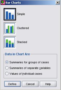
Bar charts will probably be familiar to you – a series of bars of differing heights which allow you to visually compare specific categories. A nominal or ordinal variable is placed on the horizontal x-axis such that each bar represents one category of that variable. The height of each bar is usually dictated by the number of cases in that category but it can be dictated by many different things such as the percentage of cases in the category or the average (mean) score that the category has on a second variable (which goes on the horizontal y-axis). Let’s say that we want to find out how the participants in our sample are distributed across ethnic groups - we can use bar charts to visualise the percentage of students in each category of ethnicity. Take the following route through SPSS: Graphs > Legacy Dialogs > Bar. A pop-up menu will ask you which type of bar chart you would like to create:
In this case we want the simpleversion as we only want to examine one variable. The clustered and stacked options are very useful if you want to compare bars for two variables, so they are definitely worth experimenting with. We could also alter the ‘Data in Chart Are’ options using this pop-up window. In this case the default setting is correct because we wish to compare ethnic groups and each category is a group of individual cases. There may be times when we wish to compare individuals rather than groups or even summaries of different variables (for example, comparing the mean of age 11 exam scores to the mean of age 14 scores) so it is worth keeping these options in mind. SPSS is a flexible tool. When you’re happy, click Define to open the new window:
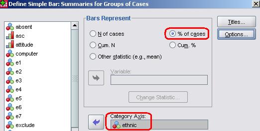
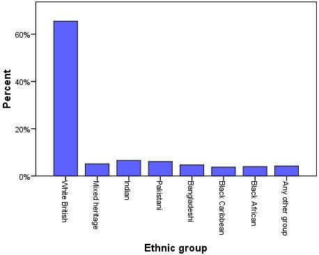
The ‘Bars represent’ section allows you to select whether you want each bar to signify the total number (N) of cases in the category or the percentage of cases. You can also look at how cases accumulate across the categories (Cum. N and Cum. %) or compare your categories across another statistic (their mean score on another variable, for example). In this instance we wish to look at the percentage of cases so click on the relevant option (highlighted in red). The next thing we need to do is tell SPSS which variable we want to take as our categories. The list on the left contains all of the variables in our dataset. The one labelled ethnicis the one we’re after and we need to move it into the box marked ‘Category axis’. When you are happy with the settings click OK to generate your bar graph: Figure 1.5.1: Breakdown of students by ethnic group
As you can see all categories were represented but the most frequent category was clearly White British, accounting for more than 60% of the total sample. Note how our chart looks somewhat different to the one in your output. We’re not
cheating...
we simply unleashed our artistic side using the chart editor. We discuss the chart editor and how to alter the presentation of your graphs and charts in Extension C
The line chart is useful for exploring how different groups fluctuate across the range of scores (or categories) of a given variable within your dataset. It is hard to explain in words (which are why graphs are so useful!) so let’s launch straight in to an example. Let’s look at socio-economic status (sec) but this time compare the different groups on their achievement in exams taken at age 14 (ks3stand). We also want to see if males and females are different in this regard. This time take the route Graphs > Legacy Dialogs > Line. You will be presented with a similar pop-up menu to before. We will choose to have Multiple lines this time:
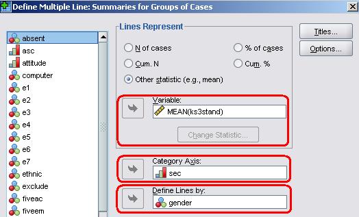
As before we want to select ‘summaries for groups of cases’. Click Define when you are happy with the setup to open the next option menu. This time we are doing something slightly different as we want to represent three variables in our chart.
You will notice that the ‘Lines Represent’ section provides identical options to those that were offered for bar graphs. Once again this section basically dictates what the vertical (y-axis) will represent. For this example we want it to represent the average exam score at age 14 for each group so select ‘other
statistic’ and move the variable ks3stand from the list on the left into the box marked Variable. You can select a variety of summary statistics instead of the mean using the ‘Change Statistic’ button located below the variable box but more often than not you will want to use the default option of the
mean
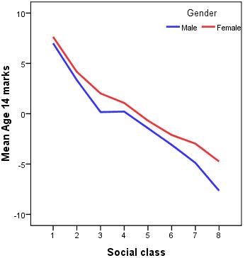
(if you are uncomfortable with the concept of the mean do not worry – we discuss it in more detail on Page 1.8 Figure 1.5.2: Line chart of age 16 exam score by gender and maternal education
The line chart shows how average scores at age 14 for both males and females are associated with SEC (the category number decreases as the background becomes less affluent). Students from more affluent backgrounds tend to perform better in their age 14 exams. There is also a gender difference, with females getting better exam scores than males in all categories of SEC. What a useful graph!
Histograms are a specific type of bar chart but they are used for several purposes in regression analysis (which we will come to in due course) and so are worth considering separately. The histogram creates a frequency distribution of the data for a given variable so you can look at the pattern of scores along the scale. Histograms are only appropriate when your variable is continuous as the process breaks the scale into intervals and counts how many cases fall into each interval to create a bar chart. Let’s show you by creating a histogram for the age 14 exam scores. Taking the route Graphs > Legacy Dialogs > Histograms will open the following menu:
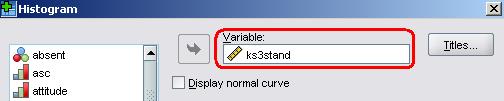
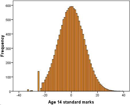
We are only interested in graphing one variable, ks3stand, so simply move this into the variable box. There are options to ‘panel’ your graphs but these are usually only useful if you are trying to directly compare two frequency distributions. The ‘Display normal curve’ tick box option is very useful if you are using your graph to check whether or not your variable is normally distributed. We will come to this later (Page 1.8 Figure 1.5.3: Histogram of Age 14 Exam scores The frequency distribution seems to create a bell shaped curve with the majority of scores falling at and around ‘0’ (which is the average score, the mean). There are relatively few scores at the extremes of the scale (-40 and 40). We will stop there. We could go through each of the graphs but it would probably become tedious for you as the process is always similar! We have encouraged you to use the Legacy Dialogs option and haven’t really spoken about is the Chart Builder. This is because the legacy options are generally more straight forward for the beginner. That said the chart builder is more free form, allowing you to produce charts in a more creative manner, and for this reason you may want to experiment with it. We will now turn our attention on to another way of displaying your data: by using tables. |
 variables to demonstrate a few of them.