Using Statistical Regression Methods in Education Research

2.8 Using SPSS to Perform a Simple Linear Regression Part 2 - Interpreting the Output
|
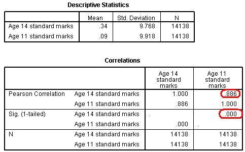
We've been given a quite a lot of output but don’t feel overwhelmed: picking out the important statistics and interpreting their meaning is much easier than it may appear at first (you can follow this on our video demonstration Figure 2.8.1: Simple Linear regression descriptives and correlations output
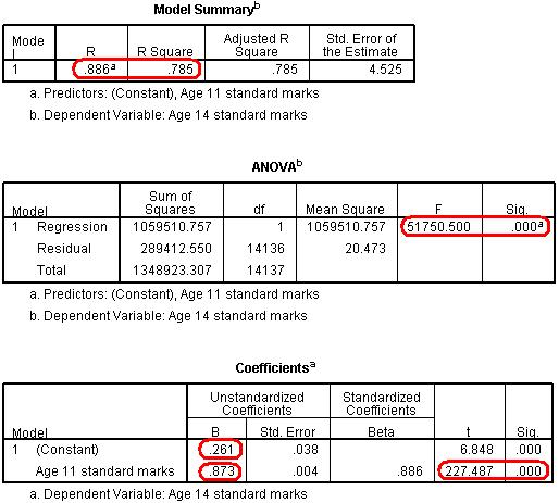
The Descriptive Statistics simply provide the mean and standard deviation for both your explanatory and outcome variables. Because we are using standardised values you will notice that the mean is close to zero. They are not exactly zero because certain participants were excluded from the analysis where they had data missing for either their age 11 or age 14 score. Extension B The next three tables (Figure 2.8.2) get to the heart of the matter, examining your regression model statistically: Figure 2.8.2: SPSS Simple linear regression model output
The Model Summary provides the correlation coefficient and coefficient of determination (r2) for the regression model. As we have already seen a coefficient of .886 suggests there is a strong positive relationship between age 11 and age 14 exam scores while r2 = .785 suggests that 79% of the variance in age 14 score can be explained by the age 11 score. In other words the success of a student at age 14 is strongly predicted by how successful they were at age 11. The ANOVA tells us whether our regression model explains a statistically significant proportion of the variance. Specifically it uses a ratio to compare how well our linear regression model predicts the outcome to how accurate simply using the mean of the outcome data as an estimate is. Hopefully our model predicts the outcome more accurately than if we were just guessing the mean every time! Given the strength of the correlation it is not surprising that our model is statistically significant (p < .0005). The Coefficients table gives us the values for the regression line. This table can look a little confusing at first. Basically in the (Constant) row the column marked B provides us with our intercept - this is where X = 0 (where the age 11 score is zero – which is the mean). In the Age 11 standard marks row the B column provides the gradient of the regression line which is the regression coefficient (B). This means that for every one standard mark increase in age 11 score (one tenth of a standard deviation) the model predicts an increase of 0.873 standard marks in age 14 score. Notice how there is also a standardised version of this second B-value which is labelled as Beta (β). This becomes important when interpreting multiple explanatory variables so we'll come to this in the next module. Finally the t-test in the second row tells us whether the ks2 variable is making a statistically significant contribution to the predictive power of the model - we can see that it is! Again this is more useful when performing a multiple linear regression.
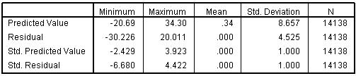
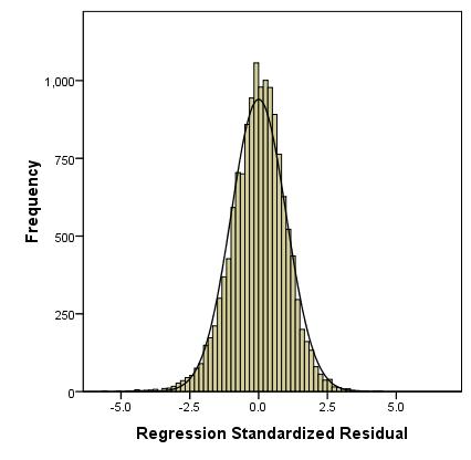
The table below (Figure 2.8.3) summarises the residuals and predicted values produced by the model. Figure 2.8.3: SPSS simple linear regression residuals output It also provides standardised versions of both of these summaries. You will also note that you have a new variable in your data set: ZRE_1 (you may want to re-label this so it is a bit more user friendly!). This provides the standardised residuals for each of your participants and can be analysed to answer certain research questions. Residuals are a measure of error in prediction so it may be worth using them to explore whether the model is more accurate for predicting the outcomes of some groups compared to others (e.g. Do boys and girls make the same amount of progress?). We requested some graphs from the Plots sub-menu when running the regression analysis so that we could test our assumptions. The histogram (Figure 2.8.4) shows us that the we may have problems with our residuals as they are not quite normally distributed - though they roughly match the overlaid normal curve, the residuals are clearly clustering around and just above the mean more than is desirable. Figure 2.8.4: Histogram of residuals for the simple linear regression
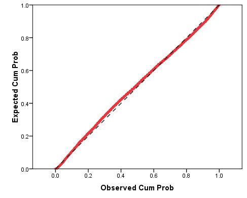
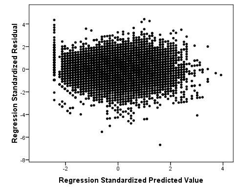
We have also generated a P-P plot to check that our residuals are normally distributed (Figure 2.8.5). We can use this plot to compare the observed residuals with what we’d expect if they were normally distributed (represented by the diagonal line). We can see that, aside from a minor departure at the observed cumulative probability of 0.4, the data is normally distributed. Figure 2.8.5: P-P plot for simple linear regression model residuals As you will see, when using real world data such imperfections are to be expected! There are some issues with the distribution of the residuals and we may need to make a judgement call about whether to remove outliers or alter our model to fix this problem. In this case we decided that the benefits of keeping all cases (including the students with low grades!) in our sample outweighed the issues regarding the ambiguous interpretation of whether or not our residuals were normally distributed. Finally, the scatterplot (Figure 2.8.6) shows us how large the standardised residual was for each case at each value of the predicted outcome. We are hoping that this will look pretty random as this would fulfil our assumption of homoscedasticity (that word again... must get you a good score in Scrabble). Figure 2.8.6: Scatterplot of residuals and predicted values
Generally there is a problem with a large range of scores at the lowest end of the predicted value (X-axis). This is due to 'floor' effects in the data. It is often worth considering identifying outlying cases and maybe removing them from the analysis but in this example such cases are too interesting to remove! Despite our floor effect, overall the residuals at each predicted value do not appear to vary differently with the exception of a few outliers so it looks as if we have met the assumption. Note that scatterplots can look like giant ink blobs when datasets are as large as this one and this can make interpreting them tricky. SPSS/PASW has a facility called ‘binning’ that is not as rubbish as it sounds (sorry) and can help us here. We discuss binning in Extension C
Overall our regression model provides us with a good method of predicting age 14 exam scores by using age 11 scores. We could report this in the following way:
We highly recommend you check the style guide for your university or target audience before writing up. Different institutions work under different criteria and often require very specific styles and formatting. Note that it is important not to simply cut and paste SPSS output into your report - it looks untidy and, as you know, it is full of unnecessary detail! Perhaps you have been introduced to a few too many new ideas in this module and you need a little lie down. Rest assured that if you can grasp the basics of simple linear regression then you are off to a flying start. Our next module on multiple linear regression simply expands on the ideas you have already bravely survived here.
We recommend that you take our quiz and work through our exercises to consolidate your knowledge. Then move on to the next module! |
 ). The first couple of tables (Figure 2.8.1) provide the basics: