Using Statistical Regression Methods in Education Research

Extension C: How do I make interpreting scatterplots of large datasets easier?
|
When graphing large datasets it is often unclear how many cases a single ‘dot’ is likely to represent. The dots in the middle of the plot may represent hundreds of cases while the outliers may represent only one. Despite this clear discrepancy all of the dots on the scatterplot look identical and so interpreting the data can be troublesome. One outlying case in 15,000 can look much more important than it actually is and lead to the data being misinterpreted. Luckily good old SPSS/PASW has a feature called ‘binning’ which can alter your
scatterplot
to show the frequency of data points at each combination of X and Y values. Basically each dot is made larger or smaller (or darker or lighter) depending on how many cases it represents. This feature is easily accessible using the chart editor so let’s have a go at binning elements on our scatterplot of ks3 and ks2 exam scores. You can have a go at
this
using the LSYPE 15,000
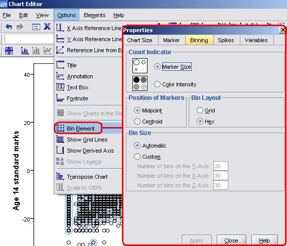
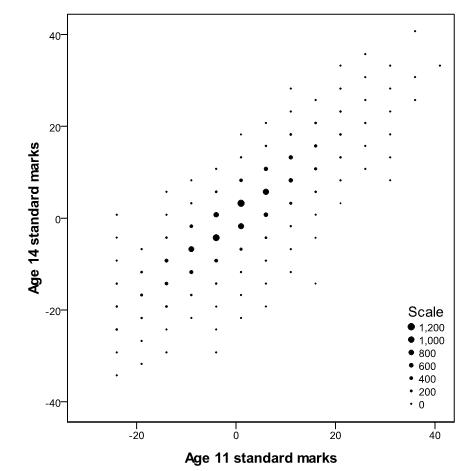
You can experiment with some of these options but we’ve kept the default selections. Click Apply and the scatterplot will be altered like so (Figure C1): Figure C1: Age 11 and age 14 exam scores scatterplot with binning
Presenting the data in this way is useful because it is now clear that most of the data points are clustered about the mean and that the outlying cases, which originally looked problematic, are relatively unimportant given the distribution of most of the data points.
|
 dataset if you like Go to the
scatterplot
in your SPSS/PASW output and double click on it to open the chart editor. Now go to Options > Bin Element and a pop-up window will appear (see below).
dataset if you like Go to the
scatterplot
in your SPSS/PASW output and double click on it to open the chart editor. Now go to Options > Bin Element and a pop-up window will appear (see below).