-
- Mod 2 - Simple Reg
- 2.1 Overview
- 2.2 Association
- 2.3 Correlation
- 2.4 Coefficients
- 2.5 Simple Linear Regression
- 2.6 Assumptions
- 2.7 SPSS and Simple Linear Regression 1
- 2.8 SPSS and Simple Linear Regression 2
- Quiz
- Exercise
- Mod 2 - Simple Reg
Using Statistical Regression Methods in Education Research

2.7 Using SPSS to Perform a Simple Linear Regression Part 1 - Running the Analysis
|
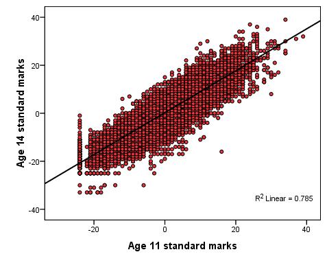
Let’s work through an example of this using SPSS/PASW. The LSYPE dataset can be used to explore the relationship between pupils' Key Stage 2 (ks2) test score (age 11) and their Key Stage 3 (ks3) test score (age 14). Let’s have another look at the scatterplot, complete with regression line, below (Figure 2.7.1). Note that the two exam scores are the standardised versions (mean = 0, standard deviation = 10), see Extension A Figure 2.7.1: Scatterplot of KS2 and KS3 Exam scores
This regression analysis has several practical uses. By comparing the actual age 14 score achieved by each pupil with the age 14 score that was predicted from their age 11 score (the residual) we get an indication of whether the student has achieved more (or less) than would be expected given their prior score. Regression thus has the potential to be used diagnostically with pupils, allowing us to explore whether a particular student made more or less progress than expected? We can also look at the average residuals for different groups of students: Do pupils from some schools make more progress than those from others? Do boys and girls make the same amount of progress? Have pupils who missed a lot of lessons made less than expected progress? It is hopefully becoming clear just how useful a simple linear regression can be when used carefully with the right research questions. Let's learn to run the basic analysis on SPSS/PASW. Why not follow us through the process using the LSYPE 15,000 dataset
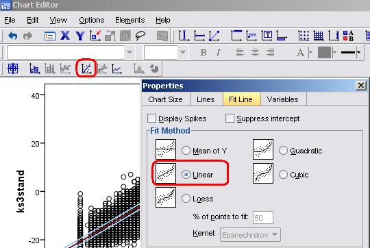
As we've already shown you how to use SPSS/PASW to draw a scatterplot When you have got your scatterplot you can use the chart editor to add the regression line. Simply double click on the graph to open the editor and then click on this icon:
This opens the properties pop-up. Select the Linear fit line, click Apply and then simply close the pop-up.
You can also customise the axes and colour scheme of your graph - you can play with the chart editor to work out how to do this if you like (we've given ours a makeover so don't worry if it looks a bit different to yours - the general pattern of the data should be the same). It is important to use the scatterplot to check for outliers or any cases which may unduly influence the regression analysis. It is also important to check that the data points use the full scale for each variable and there is no restriction in range. Looking at the scatterplot we've produced (Figure 2.7.1) there do seem to be a few outliers but given the size of the sample they are unlikely to influence the model to a large degree. It is helpful to imagine the regression line as a balance or seesaw - each data point has an influence and the further away it is from the middle (or the pivot to stretch our analogy!) the more influence it has. The influence of each case is relative to the total number of cases in the sample. In this example an outlier is one case in about 15,000 so an individual outlier, unless severely different from the expected value, will hold little influence on the model as a whole. In smaller data sets outliers can be much more influential. Of course simply inspecting a scatterplot is not a very robust way of deciding whether or not an outlier is problematic - it is a rather subjective process! Luckily SPSS provides you with access to a number of diagnostic tools which we will discuss in more depth, particularly in coming modules. More concerning are the apparent floor effects where a number of participants scored around -25 (standardised) at both age 11 and age 14. This corresponds to a real score of '0' in their exams! Scores of zero may have occurred for many reasons such as absence from exams or being placed in an inappropriate tier for their ability (e.g. taking an advanced version of a test when they should have taken a foundation one). This floor effect provides some extra challenges for our data analysis.
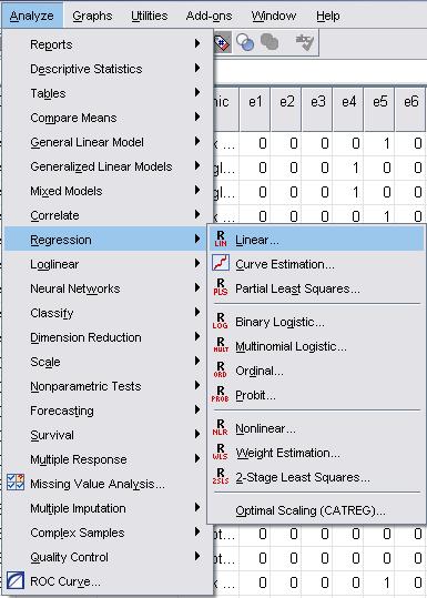
Now that we've visualised the relationship between the ks2 and ks3 scores using the scatterplot we can start to explore it statistically. Take the following route through SPSS: Analyse> Regression > Linear (see below).
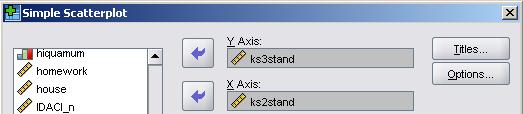
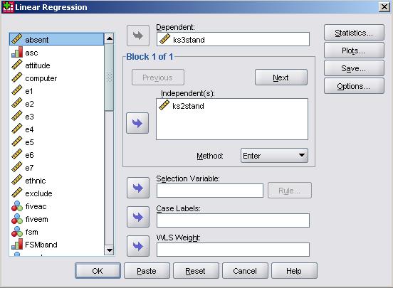
The menu shown below will pop into existence. As usual the full list of variables is listed in the window on the left. The ks3 exam score ('ks3stand') is our outcome variable so this goes in the window marked dependent. The KS2 exam score ('ks2stand') is our explanatory variable and so goes into the window marked independent(s).
Note that this window can take multiple variables and you can toggle a drop down menu called method. You will see the purpose of this when we move on to discuss multiple linear regression but leave 'Enter' selected for now. Don't click OK yet...
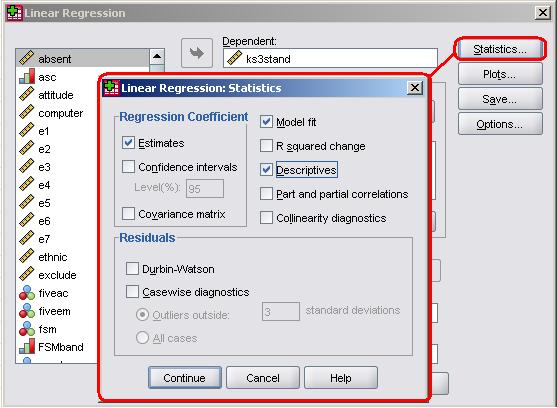
In the previous examples we have been able to leave many of the options set to their default selections but this time we are going to need to make some adjustments to the statistics, plots and save options. We need to tell SPSS that we need help checking that our assumptions about the data are correct! We also need some additional data in order to more thoroughly interrogate our research questions. Let's start with the statistics menu:
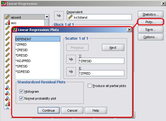
Many of these options are more important for multiple linear regression and so we will deal with them in the next module but it is worth ticking the descriptives box and getting the model fit statistics (this is ticked by default). Note also the Residuals options which allow you to identify outliers statistically. By checking casewise diagnostics and then 'outliers outside: 3 standard deviations' you can get SPSS to provide you a list of all cases where the residual is very large. We haven't done it for this dataset for one reason: we want to keep your first dabbling with simple linear regression... well, simple. This data set is so large that it will produce a long list of potential outliers that will clutter your output and cause confusion! However we would recommend doing it in most cases. To close the menu click Continue. It is important that we examine a plot of the residuals to check that a) they are normally distributed and b) that they do not vary systematically with the predicted values. The plots option allows us to do this - click on it to access the menu as shown below.
Note that rising feeling of irritation mingled with confusion that you feel when looking at the list of words in the left hand window. Horrible aren't they? They may look horrible but actually they are very useful - once you decode what they mean they are easy to use and you can draw a number of different scatterplots. For our purposes here we need to understand two of the words:
As we have discussed, the term standardised simply means that the variable is adjusted such than it has a mean of zero and standard deviation of one - this makes comparisons between variables much easier to make because they are all in the same ‘standard’ units. By plotting *ZRESID on the Y-axis and *ZPRED on the X-axis you will be able to check the assumption of homoscedasticity - residuals should not vary systematically with each predicted value and variance in residuals should be similar across all predicted values. You should also tick the boxes marked Histogram and P-P plot. This will allow you to check that the residuals are normally distributed. To close the menu click Continue. Finally let's look at the Save options:
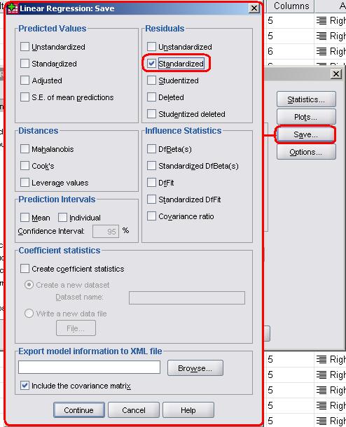
This menu allows you to generate new variables for each case/participant in your data set. The Distances and Influence Statistics allow you to interrogate outliers in more depth but we won't overburden you with them at this stage. In fact the only new variable we want is the standardised residuals (the same as our old nemesis *ZRESID) so check the relevant box as shown above. You could also get Predicted values for each case along with a host of other adjusted variables if you really wanted to! When ready, close the menu by clicking Continue. Don't be too concerned if you're finding this hard to understand. It takes practice! We will be going over the assumptions of linear regression again when we tackle multiple linear regression in the next module. Once you're happy that you have selected all of the relevant options click OK to run the analysis. SPSS/PASW will now get ridiculously overexcited and bombard you with output! Don't worry you really don't need all of it. Let's try and navigate this output together on the next page... |
 . You may also like to watch our
  .
.