Using Statistical Regression Methods in Education Research

2.6 Assumptions of Simple Linear Regression
|
Simple linear regression is only appropriate when the following conditions are satisfied:
It may seem as if we're complicating matters but checking that the analysis you perform is meeting these assumptions is vital to ensuring that you draw valid conclusions. Other important things to consider The following issues are not as important as the assumptions because the regression analysis can still work even if there are problems in these areas. However it is still vital that you check for these potential issues as they can seriously mislead your analysis and conclusions.
Let us look at these assumptions and related issues in more detail - they make more sense when viewed in the context of how you go about checking them.
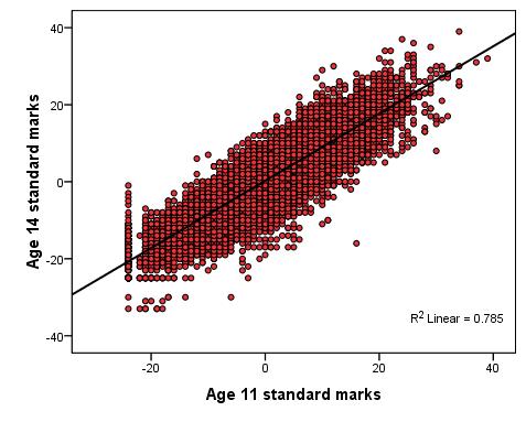
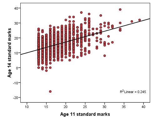
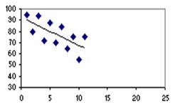
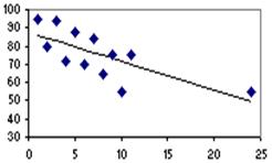
The below points form an important checklist: 1. First of all remember that for linear regression the outcome variable must be continuous. You'll need to think about Logistic and/or Ordinal regression if your data is categorical (fear not - we have modules dedicated to these). 2. Linear relationship: There must be a roughly linear relationship between the explanatory variable and the outcome. Inspect your scatterplot(s) to check that this assumption is met. 3. You may run into problems if there is a restriction of range in either the outcome variable or the explanatory variables. This is hard to understand at first so let us look at an example. Figure 2.6.1 will be familiar to you as we've used it previously - it shows the relationship between age 11 and age 14 exam scores. Figure 2.6.2 shows the same variables but includes only the most able pupils at age 11, specifically those who received one of the highest 10% of ks2 exam scores. Figure 2.6.1: Scatterplot of age 11 and age 14 exam scores - full range Correlation = .886 (r2 = .785) Figure 2.6.2: Scatterplot of age 11 and age 14 exam scores – top 10% age 11 scores Correlation = .495 (r2 = .245) Note how the restriction evident in Figure 2.6.2 severely limits the correlation which drops from .886 to .495, explaining only 25% rather than 79% (approx) of the variance in age 14 scores. The moral of the story is that your sample must be representative of any dimensions relevant to your research question. If you wanted to know the extent to which exam score at age 11 predicted to exam score at age 14 you will not get accurate results if you sample only the high ability students! Interpret r2 with caution - if you reduce the range of values of the variables in your analysis than you restrict your ability to detect relationships within the wider population. 4. Outliers: Look out for outliers as they can substantially reduce the correlation. Here is an example of this:
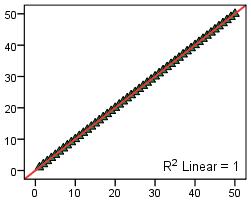
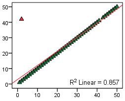
The single outlier in the plot on the right (Figure 2.6.4) reduces the correlation (from 1.00 to 0.86). This demonstrates how single unique cases can have an unduly large influence on your findings - it is important to check your scatterplot for potential outliers. If such cases seem to be problematic you may want to consider removing them from the analysis. However it is always worth exploring these rogue data points - outliers may make interesting case studies in themselves. For example if these data points represented schools it might be interesting to do a case study on the individual 'outlier' school to try to find out why it produces such strikingly different data. Findings about unique cases may sometimes have greater merit than findings from the analysis of the whole data set! 5. Influential cases: These are a type of outlier that greatly affects the slope of a regression line. The following charts compare regression statistics for a dataset with and without an influential point.
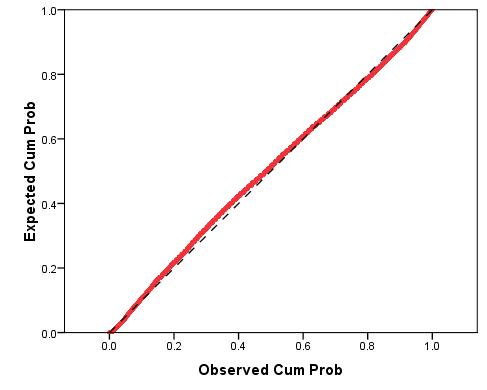
The chart on the right (Figure 2.6.6) has a single influential point, located at the high end of the X-axis (where X = 24). As a result of that single influential point the slope of the regression line decreases dramatically from -2.5 to -1.6. Note how this influential point, unlike the outliers discussed above, did not reduce the proportion of variance explained, r2 (coefficient of determination). In fact the r2 is slightly higher in the example with the influential case! Once again it is important to check your scatterplot in order to identify potential problems such as this one. Such cases can often be eliminated as they may just be errors in data entry (occasionally everyone makes tpyos...). 6. Normally distributed residuals: Residual plots can be used to ensure that there are no systematic biases in our model. A histogram of the residuals (errors) in our model can be used to loosely check that they are normally distributed but this is not very accurate. Something called a ‘P-P plot' (Figure 2.6.7) is a more reliable way to check. The P-P plot (which stands for probability-probability plot) can be used to compare the distribution of the residuals against a normal distribution by displaying their respective cumulative probabilities. Don't worry; you do not need to know the inner workings of the P-P plot - only how to interpret one. Here is an example: Figure 2.6.7: P-P plot of residuals for a simple linear regression
The dashed black line (which is hard to make out!) represents a normal distribution while the red line represents the distribution of the residuals (technically the lines represent the cumulative probabilities). We are looking for the residual line to match the diagonal line of the normal distribution as closely as possible. This appears to be the case in this example – though there is some deviation the residuals appear to be essentially normally distributed. 7. Homoscedasticity: The residuals (errors) should not vary systematically across values of the explanatory variable. This can be checked by creating a scatterplot of the residuals against the explanatory variable. The distribution of residuals should not vary appreciably between different parts of the x-axis scale – meaning we are hoping for chaotic scatterplot with no discernible pattern! This may make more sense when we come to the example. 8. Independent errors: We have shown you how you can test the appropriateness of the first two assumptions for your models, but the third assumption is rather more challenging. It can often be violated in educational research where pupils are clustered together in a hierarchical structure. For example, pupils are clustered within classes and classes are clustered within schools. This means students within the same school often have a tendency to be more similar to each other than students drawn from different schools. Pupils learn in schools and characteristics of their schools, such as the school ethos, the quality of teachers and the ability of other pupils in the school, may affect their attainment. Even if students were randomly allocated to schools, social processes often act to create this dependence. Such clustering can be taken care of by the using of design weights which indicate the probability with which an individual case was likely to be selected within the sample. For example in published analyses of LSYPE clustering was controlled by specifying school as a cluster variable and applying published design weights using the SPSS/PASW complex samples module. More generally researchers can control for clustering through the use of multilevel regression models (also called hierarchical linear models, mixed models, random effects or variance component models) which explicitly recognised the hierarchical structure that may be present in your data. Sounds complicated, right? It definitely can be and these issues are beyond the scope of this website. However if you feel you want to develop these skills we have an excellent sister website provided by another NCRM supported node called LEMMA which explicitly provides training on using multilevel modelling. We also know a good introductory text on multilevel modelling which you can find among our resources The next page will show you how to complete a simple linear regression and check the assumptions underlying it (well... most of them!) using SPSS/PASW. |