In this activity we chart Research and Development Expenditure from 1980 - 2005 for Germany, Japan, US and UK.
Firstly, insert a new sheet in your Excel workbook. Click on the Chart Wizard button in the Excel toolbar, select Line Chart and click Next. You will now need to define which data you wish to chart - to do this, click on the Series tab > Add.
Define the series Name as ="Germany" and in the Values input box click on the Collapse Dialogue button at the right hand side of the cell reference input box and then move to the Derived and chart data sheet to select your data.
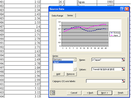
Select all data in the GDP Expenditure on R & D column for Germany from 1980 -2005 and hit return. The Source Data window will appear with a small view of the data you have plotted so far. Repeat the process of adding additional series to the chart for Japan, United States and the United Kingdom. Use the Category (X) axis labels box to add the years, and then click Next. Add a title of Research and Development Expenditure 1980-2005, an X axis label of Years and Y axis label of As a percentage of GDP. Click Next and you should then have a chart which looks very similar to the one shown in the Excel workbook on the blue R&D chart tab, but without the moving average trend lines, which we will be adding later.
You will see that the graph shows R&D expenditure as a percent of GDP is relatively high in Japan. Japanese companies tend to have high levels of spending on research and development as the Japanese system of system of banking and finance, with its predominance of indirect financing and high number of corporate alliances allows firms to invest in the longer term. UK spending on R&D, again chiefly the province of large firms, has been on a slow decline since the mid 1980's. It now stands at around 1.9% of GDP compared with an average of 2.3 per cent across Europe.
Using the technique just described, you can now try to produce the chart shown (without the trend lines) on the GDP Chart tab - Real and Unadjusted GDP growth for the United Kingdom. The data for this chart has been subsetted for you and can be found in the Derived and chart data sheet in columns m to r.
In an inflationary environment, the growth in real GDP is approximately equal to the nominal GDP growth rate less the inflation rate (although not exactly as the GDP deflator used to calculate real GDP includes government goods, export and investment goods rather than the consumer orientated basket of goods used to calculate inflation). This means that the differential tends to be high during periods of high inflation. From the graph you can see that high inflationary pressures in the early 1980's led to big price adjustments between nominal GDP and real GDP during those years.
There is more about deflating series with price indices generally in the Making cross-national comparisons using macro data unit.
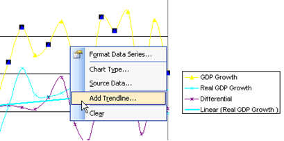
We are now going to add trend lines to the two GDP growth rates. First select the GDP growth data series by right clicking on the line in the graph. Select Add Trendline from the Format Data Series menu
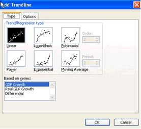
The Add trend dialogue box now gives you several options to try. Select the Linear option and press OK.
Repeat the process for the Real GDP growth rates.
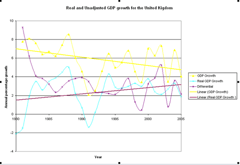
Notice Excel adds the trend line to the legend for you. The trend lines show that while nominal GDP has tended to fall over the last 25 years, once adjusted for prices, the real GDP growth rate has tended to rise.
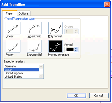
Finally, we will add a moving average trend line to the R&D expenditure data. A simple moving average is the mean of a set number of previous data points. In this case we are going to add a 5 year moving average, which for each year will be the average value of the previous 5 years. Moving averages are used to smooth out short-term fluctuations to show longer-term trends or cycles more clearly.
Go to the Derived and chart data sheet. Select the R&D expenditure data chart you produced in Activity 2. Right click on the Japan series and select Add Trendline from the menu. In the Add Trendline dialogue box, select Moving Average and set the Period to 5 and click OK. This will give us an average based on the last 5 data points, i.e. the last 5 years
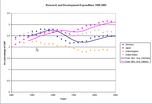
Notice the first data point on the moving average is 1985, as the average is calculated on the previous five years.
Adding the moving averages show that for all four countries, R&D expenditure fell as a % of GDP in the early 1990's Expenditure in Japan, Germany and the US has since recovered, although the UK's R&D intensity has continued to decline. The slopes of the moving average lines also tell us at what rate changes are occurring. For instance, the chart above illustrates the relative rates at which changes in spending occur. Japan's overall investment in R&D is both larger (in spending as a percentage of GDP terms) and growing at a faster rate (the slope of the average). Such basic information can highlight areas for further analysis.

