There are many ways to visualise data in UKDS.Stat. The default view is a table format but it is also possible to create bar charts, line graphs and scatter plots as well as maps. In this stage we will show you how to create a bar chart and a map.
Bar Chart
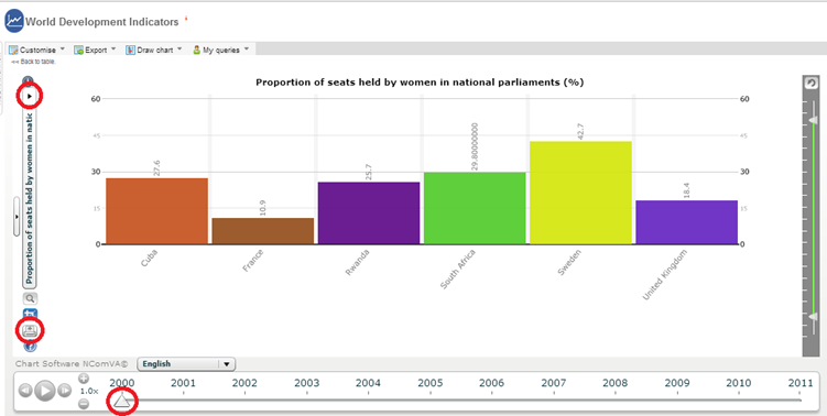
To create a bar chart with the data previously selected, click on ‘Draw chart’
and then ‘Bar’. Notice that you can scroll through the years at the
bottom
to see how things have changed throughout time, and if you select more than one subject, the left
had
side menu allows you to change subjects.
If you want to save the chart as an image click on the print icon on the bottom left, this allows
you to
export the chart as an image.
Map
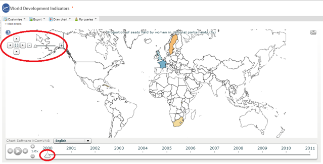
To create a map, click on ‘Draw chart’ and then
‘Map’.
Once you have finished with the mapping, return to the table format by clicking the ‘Back to table’ link displayed in top left hand corner.
There are many ways to visualise data in UKDS.Stat. The default view is a table format but it is also possible to create bar charts, line graphs and scatter plots as well as maps. In this stage we will show you how to create a bar chart and a map.
Bar Chart
To create a bar chart with the data previously selected, click on ‘Draw chart’
and then ‘Bar’. Notice that you can scroll through the years at the
bottom
to see how things have changed throughout time, and if you select more than one subject, the left
had
side menu allows you to change subjects.
If you want to save the chart as an image click on the print icon on the bottom left, this allows
you to
export the chart as an image.

Map
To create a map, click on ‘Draw chart’ and then
‘Map’.

Hover over the map to see the country names along with their values for the series you selected. It
is
possible to zoom by using the controls at the right. It is also possible to scroll through the years
to
see how things have changed. It is also possible to save the map as an image by clicking on the
print
icon in the top right corner.

